---
title: "Community"
slug: "community"
updated: 2024-04-22T10:37:12Z
published: 2024-04-22T10:37:13Z
canonical: "help.symphonysummitai.com/community"
---
> ## Documentation Index
> Fetch the complete documentation index at: https://help.symphonysummitai.com/llms.txt
> Use this file to discover all available pages before exploring further.
# Community
**Community Widget** enables users to build and engage with an online community, especially when it's focused on answering questions and sharing knowledge.
User persona: Application Designer
Let's explore the following Use Case for designing the Community Widget!
| **Use Case** | **Solution** |
| --- | --- |
| NovaTech company wants to facilitate knowledge sharing and discussion by integrating a community answers widget. They want members to ask questions, seek advice, and share knowledge within the community. | Sam can leverage the **Community** **Widget** and tailor it to precisely meet the unique needs and requirements of the organization. It facilitates interactions, promotes knowledge exchange, and enhances the overall user experience within the community platform. |
### **Configure Community Widget**
This section contains the list of steps using which Application Designer can add the widget in the Service Portal screen.
1. Navigate to **Home** > **Service Portal** > **Add Service Portal** > **Saved** **Widgets** > **Community** **Widget**.
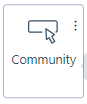 Figure: Adding Widgets
2. Customize the Service Portal by dragging the widget from widget list screen.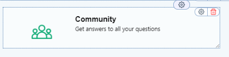Figure: Action Widget Template
3. Click **Settings** icon to view Properties pop-up.
You can view the following tabs on the **Settings** for this field.
### Properties
This section contains the list of properties using which the Application Designer can configure the respective widget feature. 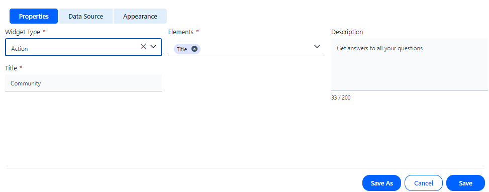Figure: Properties To know more about the fields available under the Properties section, see Field Description below.
Field Description
| Properties |
| --- |
| Widget Type | Select **Action Widget** from the drop-down list. |
| Description | Type the details of widget functionality. |
| Elements | Type the element **Title** or **Header** that should be displayed on the widget screen. |
| Title | Type the name of the widget. |
### Data Source
This section contains the list of features using which the Application Designercan select **Source**, **Application**, **Module**, **Table**, and **Form**.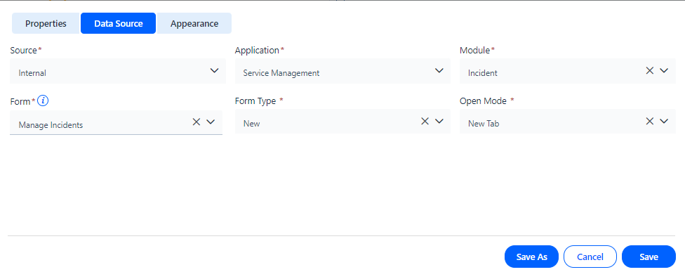Figure: Data Source The table below contains the list of fields and their descriptions that are available under the **Data Source** section:
Field Description
| **Data Source** |
| --- |
| Internal | Select the **Date Source** as **Internal** from the drop-down list. |
| Application | Select the **Application** from which the data has to be fetched. |
| Module | Select the **Module** from which the data has to be fetched. Here **Incidents** is selected under the **Module drop-down list.** |
| Form | Define the **Form** using which the widget should open when you click on it. Here **Manage Incidents** is selected from the drop-down list. |
| Form Type | Select the form type as **List** or **New** from the drop-down list. |
| Open Mode | Select the mode of opening the link as **New Tab** or **Self Window**. |
### Appearance
This section contains the list of features using which the Application Designercan select **Icon**, **Background and Border.**
Figure: Appearance The table below contains the list of fields and their descriptions that are available under the **Appearance** section: Field Description
| **Appearance** | |
| --- | --- |
| **Icon** |
| Icon Upload | Select the Icon to be uploaded. Figure: Icon selection |
| Icon Position | Select the position for the icon by selecting the size and padding. 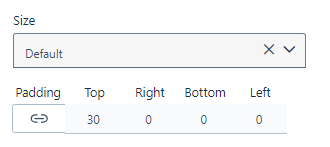Figure: Icon size and Padding |
| **Title** | |
| --- | --- |
| Text Type | Select the type of the text from drop-down list. | |
| Text Color | Select the color for the text from the palette. |
| Text Size | Select the size of the text. |
| Text Style | Select the text style from the tab. |
| Text Alignment | Select the type of alignment for the text. |
| Header Separator | |
| --- | --- |
| Border | Select the preferred border for the header. |
| Description | |
| --- | --- |
| Text Type | Select the type of the text from drop-down list. | |
| Text Color | Select the color for the text from the palette. |
| Text Size | Select the size of the text. |
| Text Style | Select the text style from the tab. |
| Text Alignment | Select the type of alignment for the text. |
| **Background** |
| --- |
| Background Type | Select the preferred background type. Figure: Background |
| Box Animation | |
| --- | --- |
| Bottom Right | Select the offset and radius for the bottom right section of the box. |
| Transform Scale | Select the X scale axis and Y axis scale axis. |
| Color | Select the color for the box. |
| Top Left | Select the offset and radius for the top left section of the box. |
| **Border** |
| --- |
| Border | You can style the border by selecting desired **Border** Type. |
| **Dimensions** |
| --- |
| **Dimensions** | You can style the border by selecting the desired Dimension value.Figure: Dimension |
You can click **Save** to save the configuration. The configured widget appears as shown below. Figure: Community
