---
title: "Internal Action widget"
slug: "internal-action-widget"
tags: ["Internal Action Widget"]
updated: 2024-05-14T13:36:07Z
published: 2024-05-14T13:36:07Z
canonical: "help.symphonysummitai.com/internal-action-widget"
---
> ## Documentation Index
> Fetch the complete documentation index at: https://help.symphonysummitai.com/llms.txt
> Use this file to discover all available pages before exploring further.
# Action widget
Having seen internal and external **Action Widget** that allows users to perform specific actions within the portal, let us explore the following Use Case for designing the Action Widget!
| **Use Case** User persona: Administrator | **Solution** |
| --- | --- |
| Sandra at HR services wants centralized dashboard provides a single interface where she can access all the applications and resources she needs. From this dashboard, she should be able to navigate to HR policies, her training portal, and any other relevant tools or systems. | Sam selects the **Action** widget from Properties and configures two separate widgets. One widget navigates to the HR policies tool, while the other directs users to the learning portal. This enhances the usability of the dashboard and improves accessibility to important HR resources for users like Sandra. |
For details about the Use Case, refer to the graphics below: 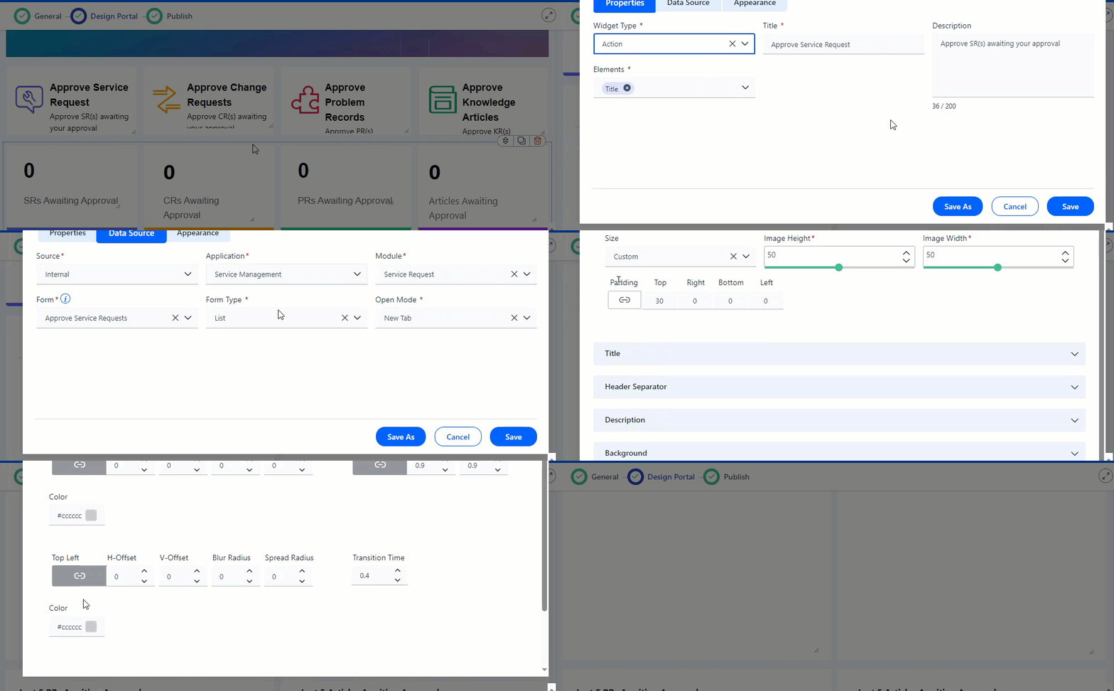
### **Configure Action Widget**
This section contains the list of steps using which Application Designer can add the Action widget in the Service Portal screen.
1. Navigate to **Design** **Service Portal** > **Widgets** > **Action Widget**.
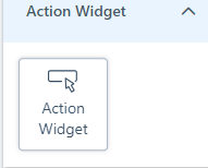 Figure: Adding Widgets
2. Customize the Service Portal by dragging the widget from widget list screen.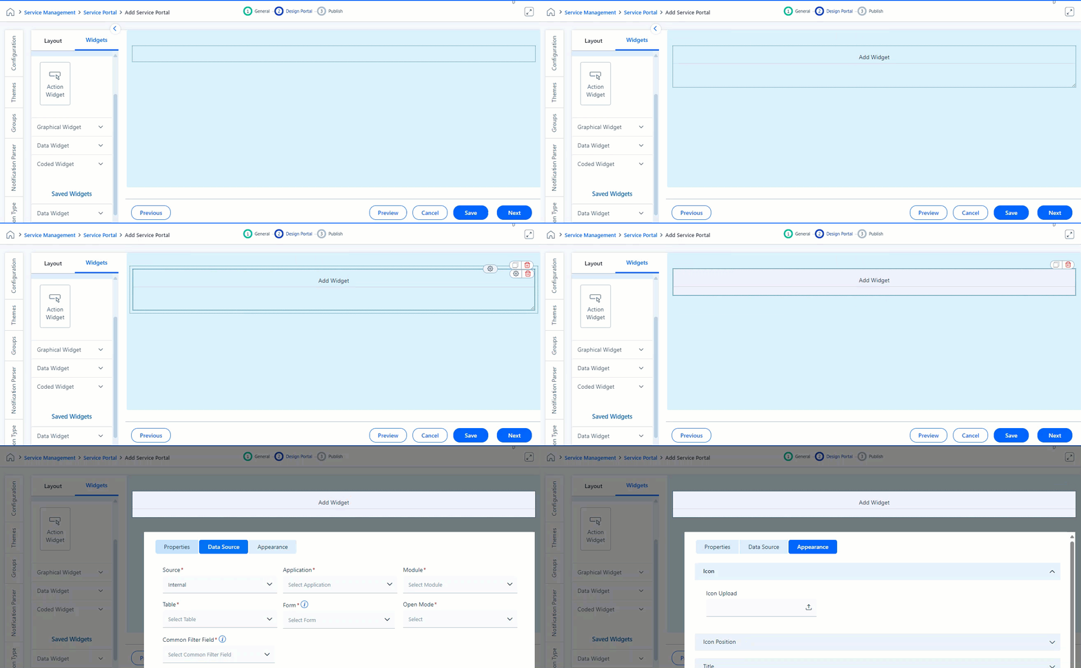Figure: Action widget
3. Click **Settings** icon to view Properties pop-up.
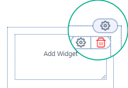Figure: Modify the properties
You can view the following tabs on the **Settings** for this field:
### Properties
This section contains the list of properties using which the Application Designer can configure the respective widget feature. To know more about the fields available under the Properties section, see Field Description below.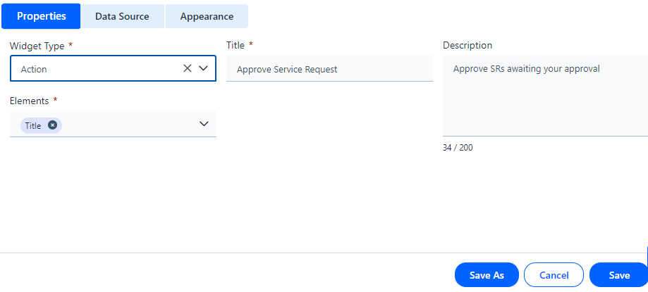Figure: Properties Field Description
| Properties |
| --- |
| Widget Type | Select **Action Widget** from the drop-down list. |
| Elements | Enter a name to the widget according to the data to be configured in the widget Title textbox using Title or Header from the Elements drop-down list. Here header or title can be added based on the requirement. For example: Let us give **Title** to Action Widget as **Log Incident**. Refer to the screenshot for more details. 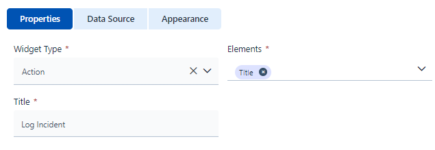Figure: Title 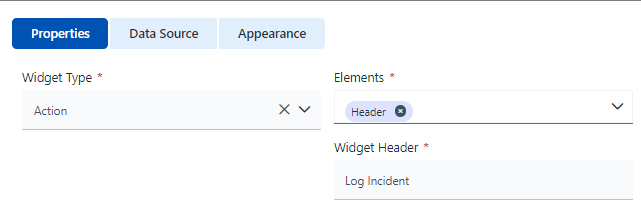 Figure: Header |
| Description | Type the details of widget functionality. Here screenshot displays the short description of the widget details.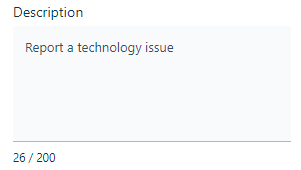Figure: Description |
### Data Source
Application Designer can configure internal or external widgets by selecting source type under the **Data Source** tab. You can select the **Source** from the drop-down list.
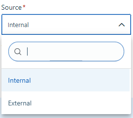Figure: Data Source type If you select **Internal** as Source type, then you need to select select **Source**, **Application**, **Module**, **Table**, and **Form**. Refer to screenshot for more details.
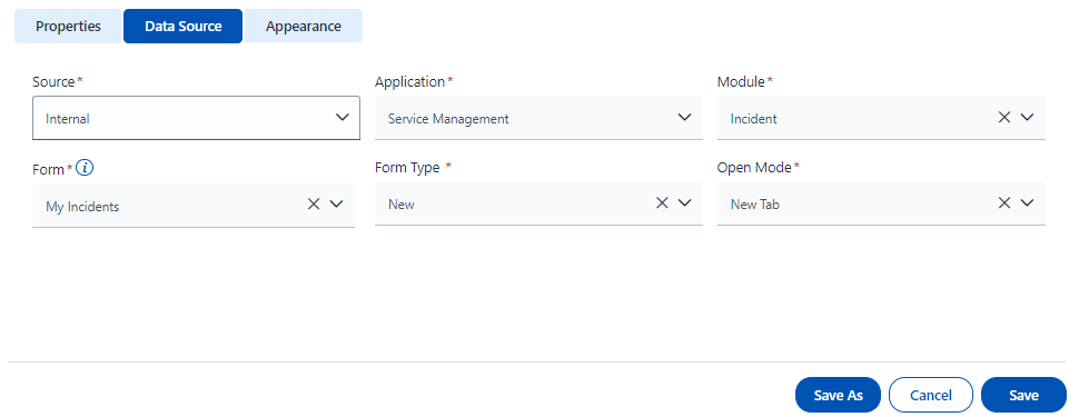Figure: Data Source The table below contains the list of fields and their descriptions that are available under the **Data Source** section: Field Description
| **Data Source** |
| --- |
| Internal | Select the **Date Source** as **Internal** from the drop-down list. Figure: Source |
| Application | Select the **Application** for which action is to be performed. 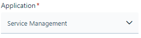Figure: Application |
| Module | Select the **Module** from which the data has to be fetched. Here **Incident** is selected under the **Module drop-down list.** **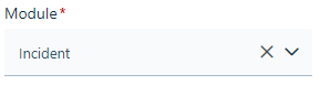**Figure: Module |
| Form | Select the **Form** from which data needs to be fetched. The drop-down list for **Form** is populated based on Module selection. Here **My Incidents** is selected from the drop-down list. 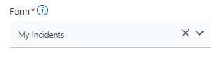Figure: Form |
| Form Type | Select the form type as **List** or **New** from the drop-down list. Form types enable users to open a specific page i.e. if the action is to create a new record, then the **New** form type is selected and if the action is to view the records, then the **List** is selected. 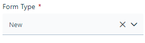Figure: Form type |
| Open Mode | Select the mode of opening the link as **New Tab** or **Self Window**. 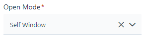Figure: Open Mode |
If you select **Ex****ternal** as the Source type, then it fetches the results from a third-party app. The screen contains the list of features using which Application Designer can select **Source** and **Form** and it appears as shown below.
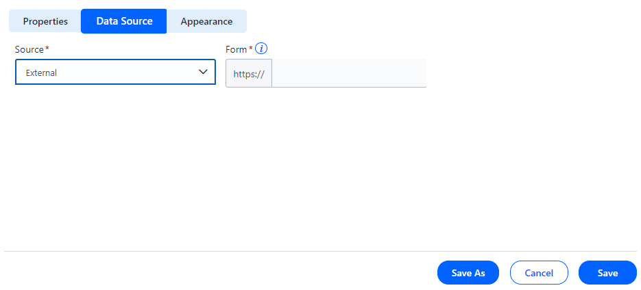Figure: Data Source The table below contains the list of fields and their descriptions that are available under the **Data Source** section: Field Description
| **Data Source** |
| --- |
| External | Select the **Date Source** as **External** from the drop-down list. |
| Form | Select the appropriate API from the drop-down list to fetch the data. 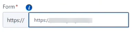Figure: Form The form specified here will open when clicked anywhere on the widget. |
### Appearance
This section contains the list of features using which the Application Designer can select **Icon**, **Background** and **Border. 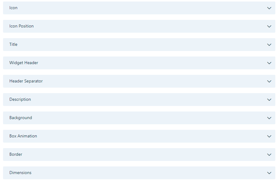**Figure: Appearance The table below contains the list of fields and their descriptions that are available under the **Appearance** section: Field Description
| **Appearance** | |
| --- | --- |
| **Icon** | |
| Icon Upload | Select the Icon to be uploaded for Action widget.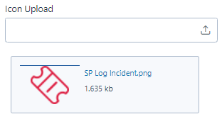Figure: Icon selection |
| Icon Position | Select the position for the icon by selecting the size and padding. 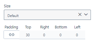Figure: Icon size and Padding |
| **Title** |
| --- |
| Text Type | Select the type of the text from drop-down list. Figure: Text Type |
| Text Color | Select the color for the text from the palette. Figure: Text Color |
| Text Size | Select the size of the text. 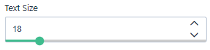Figure: Text Size |
| Text Style | Select the text style from the tab. 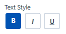 Figure: Text Style You can select Bold, Italics and Underlined Style for the Action widget. |
| Text Alignment | Select the type of alignment for the text. 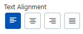Figure: Text Alignment |
| Header Separator | |
| --- | --- |
| Border | Select the preferred border style for the widget header. 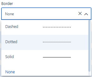Figure: Border |
| Description | |
| --- | --- |
| Text Type | Select the appropriate text type format for the widget from the drop-down list. The Text type can be changed for the widget if required. 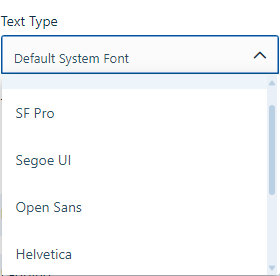 Figure: Text Type |
| Text Color | Select the appropriate font color for the widget by selecting the color from the color palette. 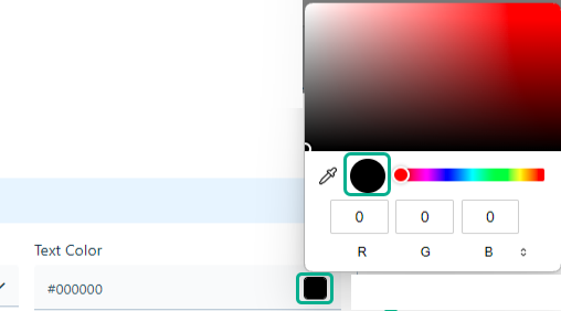Figure: Text Color |
| Text Size | Select the appropriate font size by dragging the slider. Here text size is selected as 12. 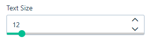Figure: Text Size |
| Text Style | Select the appropriate text style from the drop-down list. The Text Style enables simultaneous selection of one or more styles, including bold, italics and or underlined text. 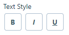Figure: Text Style |
| Text Alignment | Select the suitable Text Alignment from the list. You can align your text accordingly. 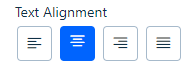Figure: Text Alignment |
| **Background** |
| Background Type | Select the preferred background type. Figure: Background |
| Box Animation | |
| --- | --- |
| Bottom Right | Select the offset and radius for the bottom right section of the box. It helps to enhance user experience and engagement by adding visual interest and dynamism to the content. 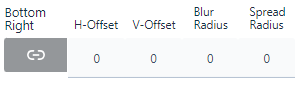Figure: Bottom Right |
| Transform Scale | Select the X scale axis and Y axis scale axis for the widget box. 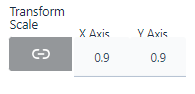Figure: Transform Scale |
| Color | Select the color for bottom right section of the box. 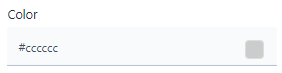Figure: Color |
| Top Left | Select the offset and radius for the top left section of the box. 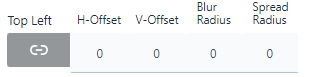Figure: Top left offset details |
| Transition Time | Select the Transition Time for the box. Figure: Transition Time |
| Color | Select the color for Top Left section of the box. Figure: Color |
| **Border** |
| --- |
| Border | Select the border by selecting desired **Border** Type from the drop-down list. |
| Dimensions |
| --- |
| Dimension | Select the widget's height and width from the drop-down list. You can set the height in pixels (px) and the width in both percentage (%) and pixels (px). Using a percentage for width allows the widget to fill the container's width.Figure: Dimension |
You can click **Save** to save the configuration. The configured **Action** Widget appears as shown below. 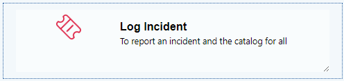Figure: Action Widget