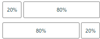
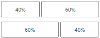
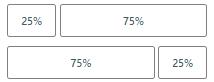
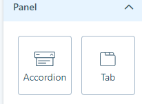
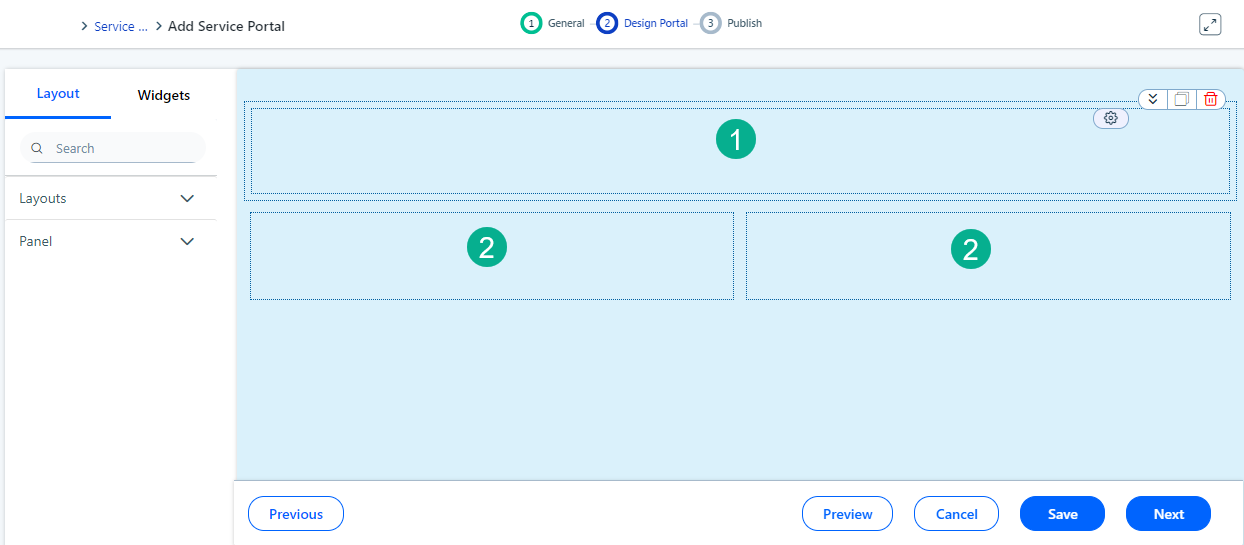
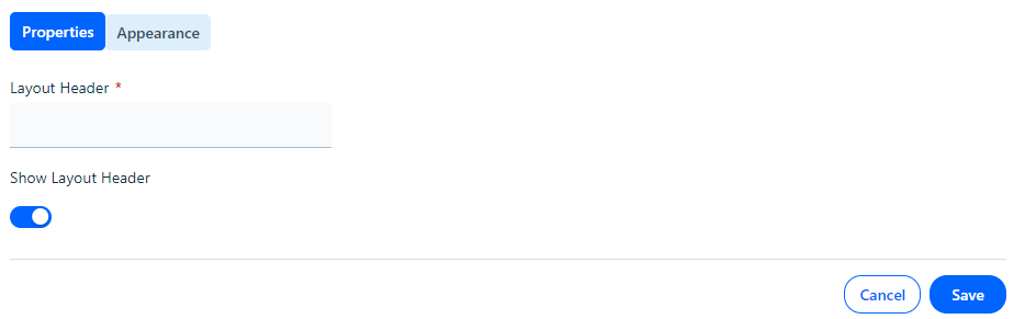
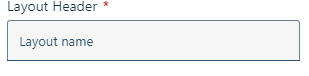
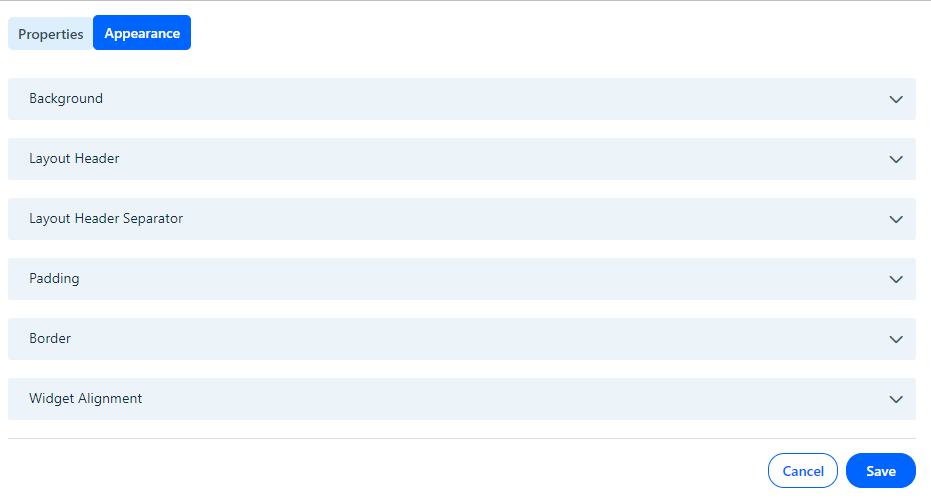
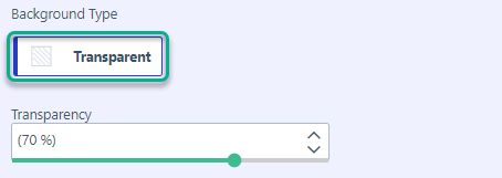
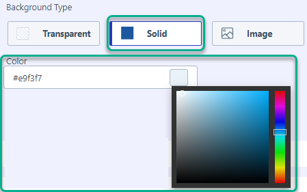
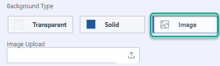
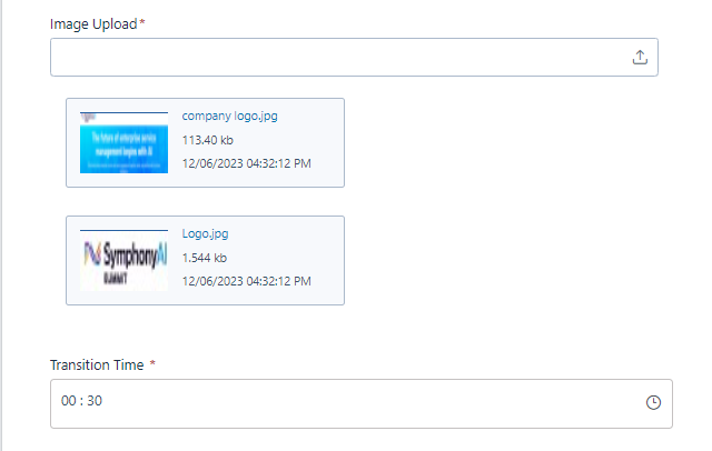
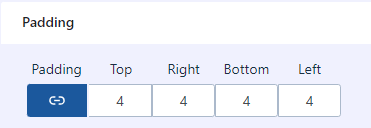
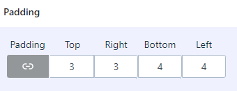
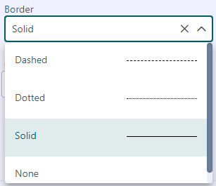
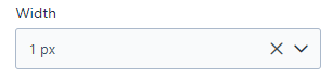
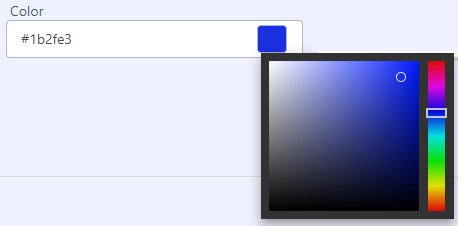
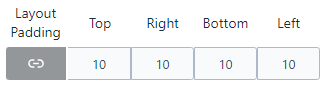
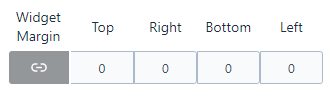
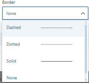
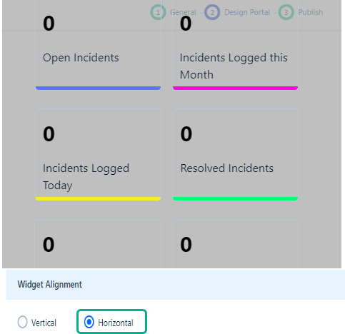
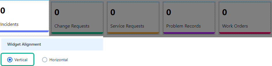
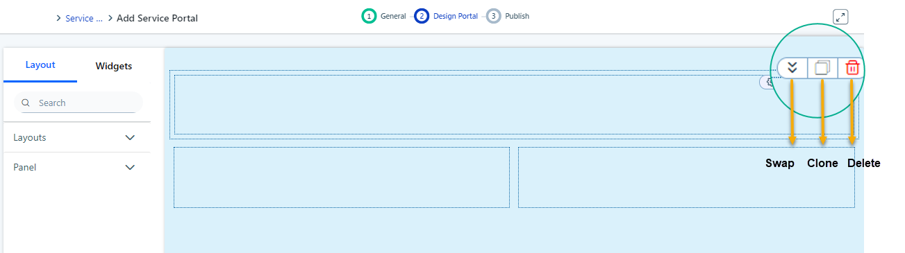
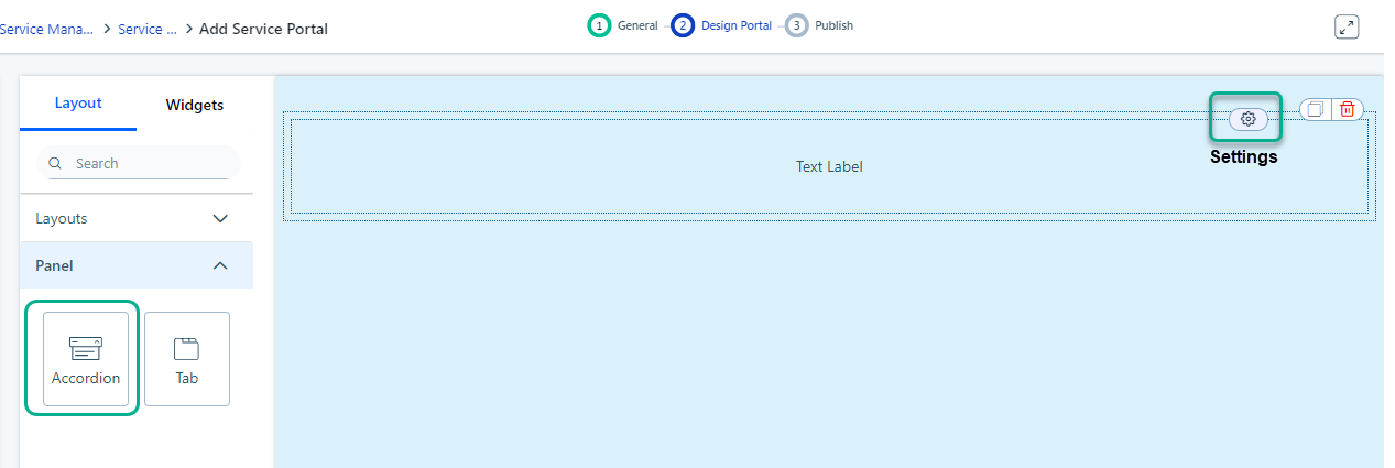
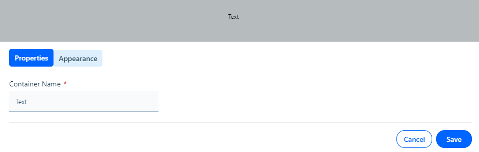
--- title: "Layouts" slug: "layouts-portal-layout" tags: ["Layout"] updated: 2024-07-02T11:42:42Z published: 2024-07-02T11:42:42Z canonical: "help.symphonysummitai.com/layouts-portal-layout" --- > ## Documentation Index > Fetch the complete documentation index at: https://help.symphonysummitai.com/llms.txt > Use this file to discover all available pages before exploring further. # Layouts ### Layouts in Service Portal In the **Service Portal**, **Layout** determines how different components, such as widgets and forms, are organized and displayed to users. The **L****ayouts** available under the **Login Screen** are summarized in the following table. Table | SL No | Layout type | Percentage | | --- | --- | --- | | 1 | ![](https://cdn.document360.io/62351b42-cfbd-43ad-8ce1-82b8f455337f/Images/Documentation/image-1711447284065.png?sv=2026-02-06&spr=https&st=2026-11-17T00%3A09%3A01Z&se=2026-11-17T01%3A09%3A01Z&sr=b&sp=r&sig=u0UOh6SApewZCc%2BeWEXufG4fMyBAkkif4lNC1eJ%2BWGg%3D)Figure: Single column | 100% | | 2 | ![](https://cdn.document360.io/62351b42-cfbd-43ad-8ce1-82b8f455337f/Images/Documentation/image-1711447344117.png?sv=2026-02-06&spr=https&st=2026-11-17T00%3A09%3A01Z&se=2026-11-17T01%3A09%3A01Z&sr=b&sp=r&sig=Rx6pAYct%2BJIPYgUHPgei4MQCyJS2or%2B7TyxuoEt1kcg%3D)Fig: Two columns in 1:1 ratio | 50% - 50% | | 3 | ![](https://cdn.document360.io/62351b42-cfbd-43ad-8ce1-82b8f455337f/Images/Documentation/image-1711448258399.png?sv=2026-02-06&spr=https&st=2026-11-17T00%3A09%3A01Z&se=2026-11-17T01%3A09%3A01Z&sr=b&sp=r&sig=5xDstCZCBgXfaWiJnTo%2FSCa00Rvn5S8R3gzTKSTDCg0%3D)Fig: Two columns in 1:4 ratio | 20% - 80% or 80% - 20% | | 4 | ![](https://cdn.document360.io/62351b42-cfbd-43ad-8ce1-82b8f455337f/Images/Documentation/image-1711448210133.png?sv=2026-02-06&spr=https&st=2026-11-17T00%3A09%3A01Z&se=2026-11-17T01%3A09%3A01Z&sr=b&sp=r&sig=9iknBmbTqnZkXq4YpIVT5IZtWii2YZBOk4D3eYiyWNQ%3D)Fig: Two columns in 3:2 ratio | 60% - 40% | | 5 | ![](https://cdn.document360.io/62351b42-cfbd-43ad-8ce1-82b8f455337f/Images/Documentation/image-1711448125217.png?sv=2026-02-06&spr=https&st=2026-11-17T00%3A09%3A01Z&se=2026-11-17T01%3A09%3A01Z&sr=b&sp=r&sig=fAmHbybO1g2sQ4KBuPPHCCdOB8SbhXGpL4Z935ox6sI%3D)Fig: Two columns in 3:1 ratio | 75% - 25% or 25% - 75% | | 6 | ![](https://cdn.document360.io/62351b42-cfbd-43ad-8ce1-82b8f455337f/Images/Documentation/image-1711447895473.png?sv=2026-02-06&spr=https&st=2026-11-17T00%3A09%3A01Z&se=2026-11-17T01%3A09%3A01Z&sr=b&sp=r&sig=zS43lPAFS%2Blg%2BCyqfrIyX8SHTquiHjzIIYcGaynXsMM%3D)Figure: Three columns in 1:2:1 ratio | 25% - 50% - 25% | | 7 | ![](https://cdn.document360.io/62351b42-cfbd-43ad-8ce1-82b8f455337f/Images/Documentation/image-1711447765253.png?sv=2026-02-06&spr=https&st=2026-11-17T00%3A09%3A01Z&se=2026-11-17T01%3A09%3A01Z&sr=b&sp=r&sig=I3L86PfC0tESkvEPYy6R%2Fk%2FDTjn%2B%2FLzrlPIrzQacTik%3D)Fig: Three columns in 1:1:1 ratio | 33% - 33% - 33% | | 8 | ![](https://cdn.document360.io/62351b42-cfbd-43ad-8ce1-82b8f455337f/Images/Documentation/image-1711447660973.png?sv=2026-02-06&spr=https&st=2026-11-17T00%3A09%3A01Z&se=2026-11-17T01%3A09%3A01Z&sr=b&sp=r&sig=Kf3yt9abNBG1pwSBeocpEw63%2FU1x0HNYLHmPMEQkcZY%3D)Fig: Four columns in 1:1:1:1 ratio | 25% - 25% - 25% - 25% | | 9 | ![](https://cdn.document360.io/62351b42-cfbd-43ad-8ce1-82b8f455337f/Images/Documentation/image-1711448445056.png?sv=2026-02-06&spr=https&st=2026-11-17T00%3A09%3A01Z&se=2026-11-17T01%3A09%3A01Z&sr=b&sp=r&sig=%2Bhh9sG%2BKwSMf800eSL5dhK24oOSBlkeD2Fzxf8azM80%3D)Fig: Four columns in 1:1:1:1:1 ratio | 20% - 20% - 20% - 20% - 20% | | 10 | ![](https://cdn.document360.io/62351b42-cfbd-43ad-8ce1-82b8f455337f/Images/Documentation/image-1711448462755.png?sv=2026-02-06&spr=https&st=2026-11-17T00%3A09%3A01Z&se=2026-11-17T01%3A09%3A01Z&sr=b&sp=r&sig=y2m43iSe6fM6N%2BCzcpuri6oCS4gE4rkiqs9pxsg%2Fgmo%3D)Fig: Four columns in 1:1:1: 1:1:1 ratio | 16% -16% -16% - 16% -16%-16% | ### Panels in Service Portal There are two types of Panels in Service Portal. They are: - **Accordion** is used to present information hierarchically, where users can click on a section header to reveal its contents. This helps in organizing content that may have multiple sections or categories, making it easier for users to navigate and find relevant information. - **Tab** is a user interface pattern that organizes content into separate sections or categories. Users can switch between **Tabs** to access different content without leaving the current page.![](https://cdn.document360.io/62351b42-cfbd-43ad-8ce1-82b8f455337f/Images/Documentation/image-1713172218336.png?sv=2026-02-06&spr=https&st=2026-11-17T00%3A09%3A01Z&se=2026-11-17T01%3A09%3A01Z&sr=b&sp=r&sig=2lZLXRpYJiY5wpuWjx8hksx%2FkOxq3jOMd3Dr9O9ZhV8%3D) Figure: Panel (Accordion and Tab) The configured Accordion and Tab appear on the consumer screen as shown below: ![](https://cdn.document360.io/62351b42-cfbd-43ad-8ce1-82b8f455337f/Images/Documentation/image-1713517795768.png?sv=2026-02-06&spr=https&st=2026-11-17T00%3A09%3A01Z&se=2026-11-17T01%3A09%3A01Z&sr=b&sp=r&sig=sJAzfdGDq4oMA3DnmTzH%2FQFc7XhYfCG9XHt9APs%2BePw%3D) User persona: Application Designer Let us start customizing the **Layouts**, **Accordion**, and **Tab** and configure the columns to house the widgets. Explore the following Use Case for customizing the Service Portal!   | **Use Case** User persona: Analyst | **Solution** | | --- | --- | | Adam wants the portal screen to be organized with various widgets displaying critical information and actions. The analyst wants critical information to be displayed as numerical widgets at the top containing the incident information (open, closed, or pending) and graphical widgets at the bottom containing the incident categorization (incident to status and incident to workgroup). | In the Portal Builder, John can drag and drop the **Layout** element onto the canvas. The requirement is to place three numerical widgets at the top. So, to fulfill this 25%-25%-25% percent layout can be selected, dragged, and dropped in the container at the top. At the bottom, to divide the screen into two halves, he can drag the layout of 50%-50% to place the widgets. To enhance the design, he can assign different backgrounds to the top and bottom layouts. | #### For details about the Use Case, refer to the graphics below: #### ![layout](https://cdn.document360.io/62351b42-cfbd-43ad-8ce1-82b8f455337f/Images/Documentation/layout.gif?sv=2026-02-06&spr=https&st=2026-11-17T00%3A09%3A01Z&se=2026-11-17T01%3A09%3A01Z&sr=b&sp=r&sig=CzklAib2DUOaULC3hVZ1iozU4ZUEWlIR89XXPhG3k7Y%3D) ### Configure Layout ## This section contains the list of steps using which Application Designer can configure the layouts in the **Service Port****al** through the Design Portal screen. #### Prerequisites ![](https://cdn.document360.io/62351b42-cfbd-43ad-8ce1-82b8f455337f/Images/Documentation/Prerequisites-icon(1).png?sv=2026-02-06&spr=https&st=2026-11-17T00%3A09%3A01Z&se=2026-11-17T01%3A09%3A01Z&sr=b&sp=r&sig=AlO4Sfj3%2BJU%2BAJC2G8negZvSP%2BHh6%2BbSdLYaA8QLUvA%3D) 1. Application should be created. 2. Domain, Sub Domain, Module, and Tenant values should be configured. 3. Navigate to the ![](https://cdn.document360.io/62351b42-cfbd-43ad-8ce1-82b8f455337f/Images/Documentation/image-1712730662857.png?sv=2026-02-06&spr=https&st=2026-11-17T00%3A09%3A01Z&se=2026-11-17T01%3A09%3A01Z&sr=b&sp=r&sig=lj88mgO%2Bq4vSYQxx%2BiiL4BzBeYy%2B6ZEaizxUxwUZ1w4%3D) settings icon. 4. Select **Design Studio** > **Application** > **Service Portal**. Create a new **Service Portal** and configure the properties in **General** tab. To configure the **Layout**, perform the following steps: 1. Navigate to **Design** **Service Portal** > **Layout**. 2. Under the **Layout** tab, you can view a list of layouts that can be dragged and dropped anywhere on the Service Portal. 3. Drag and drop **Layou****ts** to the Service Portal as needed. The screenshot displays the layout with percentages of 100% and 50-50% (1 depicts 100%, and 2 depicts 50%-50%). ![](https://cdn.document360.io/62351b42-cfbd-43ad-8ce1-82b8f455337f/Images/Documentation/image-1712898133168.png?sv=2026-02-06&spr=https&st=2026-11-17T00%3A09%3A01Z&se=2026-11-17T01%3A09%3A01Z&sr=b&sp=r&sig=Rh%2B5XO1CtYmqHv2ioZK47hlPPX%2FsLuXviRqcetuLnvQ%3D)Figure: Drag and drop Layouts 4. Click **Settings** to configure the properties of the container. The screenshot of **Properties** tab appears as shown below.![](https://cdn.document360.io/62351b42-cfbd-43ad-8ce1-82b8f455337f/Images/Documentation/image-1712898267457.png?sv=2026-02-06&spr=https&st=2026-11-17T00%3A09%3A01Z&se=2026-11-17T01%3A09%3A01Z&sr=b&sp=r&sig=vUCOUZtGr71KIk6ueZ%2FFFtb38VrM3yjfPEq3%2F%2Fk92t4%3D)Figure: Configuring the properties 5. Type the name in the **Layout Header** textbox in the **Properties** pop-up window. Here **Layout Header** is specified as **Layout name**. You can click **Show Layout Header** to display the name on the screen. The header name will not be displayed in **Customer** screens. ![](https://cdn.document360.io/62351b42-cfbd-43ad-8ce1-82b8f455337f/Images/Documentation/image-1712898412573.png?sv=2026-02-06&spr=https&st=2026-11-17T00%3A09%3A01Z&se=2026-11-17T01%3A09%3A01Z&sr=b&sp=r&sig=R5mZMMFk2u6Mtjn6a3fy543RdoYrbrOYS8uzn2L%2BsfU%3D)Figure: Layout Header 6. Navigate to the **Appearance** tab for applying background to the **Layout**. A pop-up window appears as shown below. ![](https://cdn.document360.io/62351b42-cfbd-43ad-8ce1-82b8f455337f/Images/Documentation/image-1712898601838.png?sv=2026-02-06&spr=https&st=2026-11-17T00%3A09%3A01Z&se=2026-11-17T01%3A09%3A01Z&sr=b&sp=r&sig=OhNd068RDd2LcASd4oMYYWhGtnCU30q5iL%2FlMI%2FwetQ%3D)Figure: Appearance The table below contains the list of fields and their descriptions that are available under the **Appearance** section. ### Field Description | Field | Description | | --- | --- | | **Background** | | Background Type | Give an appropriate background to the Properties. ![](https://cdn.document360.io/62351b42-cfbd-43ad-8ce1-82b8f455337f/Images/Documentation/image-1685698285816.png?sv=2026-02-06&spr=https&st=2026-11-17T00%3A09%3A01Z&se=2026-11-17T01%3A09%3A01Z&sr=b&sp=r&sig=Q4foSMkqDRDp%2FRV%2Fq0QzcWmkW%2FM5w8gOBKSKW7E82TA%3D)Figure: Background Type | | Transparent | If you select **Transparent**, then you can add transparency to the Background. The screen appears as shown below: ![](https://cdn.document360.io/62351b42-cfbd-43ad-8ce1-82b8f455337f/Images/Documentation/image-1674217700168.png?sv=2026-02-06&spr=https&st=2026-11-17T00%3A09%3A01Z&se=2026-11-17T01%3A09%3A01Z&sr=b&sp=r&sig=KWd%2BB4xemH36ieWAja%2B0h3heggWwz72s0bQ7c1%2F4PU4%3D)Figure: Transparency Use a slider to define the percentage of transparency. For example, here Transparency is kept at 70 %. | | Solid | If you select **Solid**, then you can select the color of the Background. The screen appears as shown below: ![](https://cdn.document360.io/62351b42-cfbd-43ad-8ce1-82b8f455337f/Images/Documentation/image-1674218884342.png?sv=2026-02-06&spr=https&st=2026-11-17T00%3A09%3A01Z&se=2026-11-17T01%3A09%3A01Z&sr=b&sp=r&sig=iO0sgaRUNXN2cbLXrUxtFZ%2Fh4twwsrtFE0JpXlmHKwE%3D)Figure: Solid Background | | Image | Select **Image** if you want can upload the image to Background. Upload the image by browsing from the device. The screen appears as shown below: ![](https://cdn.document360.io/62351b42-cfbd-43ad-8ce1-82b8f455337f/Images/Documentation/image-1674220725876.png?sv=2026-02-06&spr=https&st=2026-11-17T00%3A09%3A01Z&se=2026-11-17T01%3A09%3A01Z&sr=b&sp=r&sig=0GNWj0NZyDiNh9axasSgrSKeffyTMF29y%2FNHwvel06A%3D)Figure: Image upload The screen appears as shown: ![](https://cdn.document360.io/62351b42-cfbd-43ad-8ce1-82b8f455337f/Images/Documentation/image-1674467263574.png?sv=2026-02-06&spr=https&st=2026-11-17T00%3A09%3A01Z&se=2026-11-17T01%3A09%3A01Z&sr=b&sp=r&sig=VsTRcIij7eQtPDxiUMARM57djloj3NYqvObJwAr4aU8%3D)Figure: Uploaded image padding You can upload multiple images and add **Transition Time** as shown in the screenshot. ![](https://cdn.document360.io/62351b42-cfbd-43ad-8ce1-82b8f455337f/Images/Documentation/image-1701860677960.png?sv=2026-02-06&spr=https&st=2026-11-17T00%3A09%3A01Z&se=2026-11-17T01%3A09%3A01Z&sr=b&sp=r&sig=9o70MfnBuaF3c0KlVclm4YP13svUqdsu86EJSZztjg0%3D) Figure: Multiple image upload | | **Layout Header** | | Padding | Add auto padding to the **Top**, **Right**, **Bottom** and **Left** by enabling the **Padding** switch in the Properties popup. The screen appears as: ![](https://cdn.document360.io/62351b42-cfbd-43ad-8ce1-82b8f455337f/Images/Documentation/image-1674468146741.png?sv=2026-02-06&spr=https&st=2026-11-17T00%3A09%3A01Z&se=2026-11-17T01%3A09%3A01Z&sr=b&sp=r&sig=NbU33vnvsakYepPP217So%2BFbyLB89BRH3KTI8zxZVP4%3D)Figure: Enable auto padding If you disable the **Padding** switch, you can adjust the **Top**, **Right**, **Bottom** and **Left** padding of the container as needed! ![](https://cdn.document360.io/62351b42-cfbd-43ad-8ce1-82b8f455337f/Images/Documentation/image-1674468568665.png?sv=2026-02-06&spr=https&st=2026-11-17T00%3A09%3A01Z&se=2026-11-17T01%3A09%3A01Z&sr=b&sp=r&sig=PBGE1wlMFyv%2BUgUq2vnM3%2BmXSMhdJe9xMmZmjxtDZJU%3D)Figure: Disable auto padding | | **Layout Header Separator** | | Border | Style the border by the selecting desired Border Type. The screenshot displays with **Border** style selected as **Solid**. ![](https://cdn.document360.io/62351b42-cfbd-43ad-8ce1-82b8f455337f/Images/Documentation/image-1674469155559.png?sv=2026-02-06&spr=https&st=2026-11-17T00%3A09%3A01Z&se=2026-11-17T01%3A09%3A01Z&sr=b&sp=r&sig=OE3Ko3AmEM2MLAFurbNnEHVAPPqvO06c18rVmc6shrY%3D)Figure: Border style | | Width | Select the thickness of the divider by selecting the appropriate option from the Width dropdown. ![](https://cdn.document360.io/62351b42-cfbd-43ad-8ce1-82b8f455337f/Images/Documentation/image-1685698755520.png?sv=2026-02-06&spr=https&st=2026-11-17T00%3A09%3A01Z&se=2026-11-17T01%3A09%3A01Z&sr=b&sp=r&sig=BBfLcN2c5djb5tPU8HtIg3eeNedv5nCvvZujYWcNlXw%3D)Figure: Width dropdown | | Color | Give the desired color for the border. You can click the default color cube to load the color palette and select the desired color tile. ![](https://cdn.document360.io/62351b42-cfbd-43ad-8ce1-82b8f455337f/Images/Documentation/image-1674470915454.png?sv=2026-02-06&spr=https&st=2026-11-17T00%3A09%3A01Z&se=2026-11-17T01%3A09%3A01Z&sr=b&sp=r&sig=uvNYhUVpbTDdmUTOvAXOSDhMKcRDoxODAONJLVQ1JME%3D)Figure: Color | | **Padding** | | Layout Padding | Select the padding for the margin for the Layout. ![](https://cdn.document360.io/62351b42-cfbd-43ad-8ce1-82b8f455337f/Images/Documentation/image-1685698901563.png?sv=2026-02-06&spr=https&st=2026-11-17T00%3A09%3A01Z&se=2026-11-17T01%3A09%3A01Z&sr=b&sp=r&sig=%2F8QsWUwaJyO7vve7KqS64bAH5nLedi9h4DjXPJ0%2Bnp8%3D)Figure: Layout Padding | | Widget Margin | Select the width of the margin of the Widget. ![](https://cdn.document360.io/62351b42-cfbd-43ad-8ce1-82b8f455337f/Images/Documentation/image-1685698927286.png?sv=2026-02-06&spr=https&st=2026-11-17T00%3A09%3A01Z&se=2026-11-17T01%3A09%3A01Z&sr=b&sp=r&sig=GO4FKF60OuYLNLH2C6%2BMh16OIKFXP%2FrGNoWuq3dQBNM%3D)Figure: Widget Margin | | **Border** | | Border | Customize the border style by choosing your preferred type from the drop-down menu. Options include Dashed, Dotted, Solid, or None.![](https://cdn.document360.io/62351b42-cfbd-43ad-8ce1-82b8f455337f/Images/Documentation/image-1712898892467.png?sv=2026-02-06&spr=https&st=2026-11-17T00%3A09%3A01Z&se=2026-11-17T01%3A09%3A01Z&sr=b&sp=r&sig=twsba37GeUaFTEU2IgWqGsCR%2FAGAuUclQplANBCUdmI%3D)Figure: Border | | **Widget Alignment** | Choose the desired alignment for the widget in a layout. ![](https://cdn.document360.io/62351b42-cfbd-43ad-8ce1-82b8f455337f/Images/Documentation/image-1685700788882.png?sv=2026-02-06&spr=https&st=2026-11-17T00%3A09%3A01Z&se=2026-11-17T01%3A09%3A01Z&sr=b&sp=r&sig=KRyHAi9%2Fft%2FIJ%2FUJmmduOtXTOpzRgWO5oWaQ2a8j9VM%3D) Figure: Widget Alignment The below screenshots showcase the versatility of this widget alignment feature. If aligned horizontally, widgets are arranged one below the other. Refer to screenshot. ![](https://cdn.document360.io/62351b42-cfbd-43ad-8ce1-82b8f455337f/Images/Documentation/image-1712899935519.png?sv=2026-02-06&spr=https&st=2026-11-17T00%3A09%3A01Z&se=2026-11-17T01%3A09%3A01Z&sr=b&sp=r&sig=QTCL%2BZ3K5%2FnaIWuTNbRzahPryAf0ozbWwJLLrdW%2F4Sc%3D) Figure: Widget Alignment (Horizontal) When vertically aligned, widgets will be displayed in a row, resembling the layout specified in the screenshot. ![](https://cdn.document360.io/62351b42-cfbd-43ad-8ce1-82b8f455337f/Images/Documentation/image-1712900274280.png?sv=2026-02-06&spr=https&st=2026-11-17T00%3A09%3A01Z&se=2026-11-17T01%3A09%3A01Z&sr=b&sp=r&sig=gsduvOSa2P1FCKDnlEC0TB97owtqUqogmzBkSLURuz0%3D)Figure: Widget Alignment (Horizontal) | 7. Click **Save** to save the configuration. NoteYou can swap (top or bottom), clone, or delete the Layout by using the respective icons on the top right corner of the **Service Portal.** Refer to the screenshot for more details.![](https://cdn.document360.io/62351b42-cfbd-43ad-8ce1-82b8f455337f/Images/Documentation/image-1712906088721.png?sv=2026-02-06&spr=https&st=2026-11-17T00%3A09%3A01Z&se=2026-11-17T01%3A09%3A01Z&sr=b&sp=r&sig=%2Bi09I6k3IfvD3Jfpa1xiUncEcbFSm%2B%2BWL3d7RNa1tf8%3D)Figure: Swap clone and delete actions ### Configure Accordion To configure the **Accordion**, perform the following steps: 1. If you select **Accordion** under **Panel**, you can configure the **Properties** and **Appearance** by clicking the **Settings** icon as shown in the screenshot. ![](https://cdn.document360.io/62351b42-cfbd-43ad-8ce1-82b8f455337f/Images/Documentation/image-1712901693339.png?sv=2026-02-06&spr=https&st=2026-11-17T00%3A09%3A01Z&se=2026-11-17T01%3A09%3A01Z&sr=b&sp=r&sig=2hp2f30TqjBXgoVX%2F1MJKSYKUgL4W%2BQ7R5mfH%2BMFMTE%3D)Figure: Accordion properties 2. Specify the values for **Container Name** and **Layout Header** based on the **Accordion**.  ![](https://cdn.document360.io/62351b42-cfbd-43ad-8ce1-82b8f455337f/Images/Documentation/image-1712902025172.png?sv=2026-02-06&spr=https&st=2026-11-17T00%3A09%3A01Z&se=2026-11-17T01%3A09%3A01Z&sr=b&sp=r&sig=y%2ByonBwm0P%2BDhRxF1Ag%2BH58WBKMuEImSGKo6O9wAqEw%3D)Figure: Configuring the Accordion properties 3. Navigate to the **Appearance** tab for applying background to the **Accordion**. A pop-up window appears as shown below. ![](https://cdn.document360.io/62351b42-cfbd-43ad-8ce1-82b8f455337f/Images/Documentation/image-1712898601838.png?sv=2026-02-06&spr=https&st=2026-11-17T00%3A09%3A01Z&se=2026-11-17T01%3A09%3A01Z&sr=b&sp=r&sig=OhNd068RDd2LcASd4oMYYWhGtnCU30q5iL%2FlMI%2FwetQ%3D)Figure: Appearance   For more details about the **Appearance** section, see [**Field Description**](/summit-platform/docs/layouts-portal-layout#field-description).    










### Configure Tabs To configure **Tabs**, perform the following steps: 1. Add a layout and drop the **Tab** after selecting it from the **Panel** section. ![](https://cdn.document360.io/62351b42-cfbd-43ad-8ce1-82b8f455337f/Images/Documentation/image-1712902928803.png?sv=2026-02-06&spr=https&st=2026-11-17T00%3A09%3A01Z&se=2026-11-17T01%3A09%3A01Z&sr=b&sp=r&sig=8vEcwX0%2FiLm27hMi8fruz7Y9y07zbUbqUI8%2FbjFKP1I%3D)Figure: Tab 2. You can add multiple Tabs and configure the Properties and Appearance by clicking Settings icon as shown in the screenshot. Figure: Multiple Tabs    
3. Click the Settings icon on Tab1. **Edit Tab** label name gets displayed on the icon. ![](https://cdn.document360.io/62351b42-cfbd-43ad-8ce1-82b8f455337f/Images/Documentation/image-1712903659140.png?sv=2026-02-06&spr=https&st=2026-11-17T00%3A09%3A01Z&se=2026-11-17T01%3A09%3A01Z&sr=b&sp=r&sig=DDeowhOi7GA1S4e%2BRsG5Ti3Toq%2FlJe10ZigseA1DA%2FE%3D)Figure: Edit tab 4. Navigate to the **Properties** tab. The table below contains the list of fields and their descriptions that are available under the **Properties** section. ![](https://cdn.document360.io/62351b42-cfbd-43ad-8ce1-82b8f455337f/Images/Documentation/image-1712903832117.png?sv=2026-02-06&spr=https&st=2026-11-17T00%3A09%3A01Z&se=2026-11-17T01%3A09%3A01Z&sr=b&sp=r&sig=WHxKali9H6%2FFHR2H3m%2BU%2FtFPWKO8yEJemr5OOksxZE4%3D)Figure: Properties Refer to the Field Description for more details. Field Description | Properties | | --- | | Title | Enter the title for the Tab. ![](https://cdn.document360.io/62351b42-cfbd-43ad-8ce1-82b8f455337f/Images/Documentation/image-1712905338300.png?sv=2026-02-06&spr=https&st=2026-11-17T00%3A09%3A01Z&se=2026-11-17T01%3A09%3A01Z&sr=b&sp=r&sig=gNs59VuqFWRECPWdUh%2BnFCre8T17Y3BByjrKPj7pFFs%3D)Figure: Tab Here it is titled as **General**. | | Icon | Select an appropriate icon to the Tab based on the attribute. ![](https://cdn.document360.io/62351b42-cfbd-43ad-8ce1-82b8f455337f/Images/Documentation/image-1712904942243.png?sv=2026-02-06&spr=https&st=2026-11-17T00%3A09%3A01Z&se=2026-11-17T01%3A09%3A01Z&sr=b&sp=r&sig=yppKAStzvSwyxvEFEXexYJk9hBiZjvlmovimZhilrZA%3D) | | Icon Position | Select the icon position from the drop-down list. You can select left or right based on the requirement. ![](https://cdn.document360.io/62351b42-cfbd-43ad-8ce1-82b8f455337f/Images/Documentation/image-1712905622615.png?sv=2026-02-06&spr=https&st=2026-11-17T00%3A09%3A01Z&se=2026-11-17T01%3A09%3A01Z&sr=b&sp=r&sig=en30HpNcQH05vNsby7EK6eBpaUvzSdExjuTeVzBU8tw%3D)Figure: Icon Position | | Sort Order | Define the sequence in which the tab should appear. ![](https://cdn.document360.io/62351b42-cfbd-43ad-8ce1-82b8f455337f/Images/Documentation/image-1712904963732.png?sv=2026-02-06&spr=https&st=2026-11-17T00%3A09%3A01Z&se=2026-11-17T01%3A09%3A01Z&sr=b&sp=r&sig=LqVtETpbwLT4%2Fro6pAfY%2FI4jWU4z0XpAUvt601d9cN4%3D)Figure: Sort Order For example, IT Services tab is defined with Sort Order as 1 and the HR Services tab is defined with Sort Order as 2. See the screenshot as shown below. ![](https://cdn.document360.io/62351b42-cfbd-43ad-8ce1-82b8f455337f/Images/Documentation/image-1713352126093.png?sv=2026-02-06&spr=https&st=2026-11-17T00%3A09%3A01Z&se=2026-11-17T01%3A09%3A01Z&sr=b&sp=r&sig=q%2BXHBR0iFXFpPYJmd87KphYaU5YD0ZdjJQaG9CB5vv8%3D)Figure: Sort Order 1 ![](https://cdn.document360.io/62351b42-cfbd-43ad-8ce1-82b8f455337f/Images/Documentation/image-1713352266860.png?sv=2026-02-06&spr=https&st=2026-11-17T00%3A09%3A01Z&se=2026-11-17T01%3A09%3A01Z&sr=b&sp=r&sig=EX7EnSDJRdC8p3yCXyFD3Ji7CTmr%2FpMzvWEbQOLckUM%3D)Figure: Sort Order 2 | 5. Navigate to the **Appearance** tab for applying background to the **Tabs**. A pop-up window appears as shown below. ![](https://cdn.document360.io/62351b42-cfbd-43ad-8ce1-82b8f455337f/Images/Documentation/image-1712904048670.png?sv=2026-02-06&spr=https&st=2026-11-17T00%3A09%3A01Z&se=2026-11-17T01%3A09%3A01Z&sr=b&sp=r&sig=nojk68Am4w7RcDwNxXVuAORj0frGEbJuIwGV7PkcX38%3D)Figure: Appearance 6. Select the **Background Type** from the **Background**. A transparent or solid color or image or color icon can be selected for the background. Refer to the screenshot for more details. ![](https://cdn.document360.io/62351b42-cfbd-43ad-8ce1-82b8f455337f/Images/Documentation/image-1712904589366.png?sv=2026-02-06&spr=https&st=2026-11-17T00%3A09%3A01Z&se=2026-11-17T01%3A09%3A01Z&sr=b&sp=r&sig=uE%2FeFGM2QXOL3FCogkC4v%2BWhkpekCPnfsKSxVR3qwOI%3D)Figure: Background Type 7. Click **Save** to save the **Tab** configurations. ![](https://cdn.document360.io/62351b42-cfbd-43ad-8ce1-82b8f455337f/Images/Glossary/image-1711453427119.png?sv=2026-02-06&spr=https&st=2026-11-17T00%3A09%3A01Z&se=2026-11-17T01%3A09%3A01Z&sr=b&sp=r&sig=0yVMWvfoyMrizpD%2BbfBEJT7PhCZxd1FsCuq92%2FYLe%2F8%3D) ![](https://cdn.document360.io/62351b42-cfbd-43ad-8ce1-82b8f455337f/Images/Glossary/image-1709619582458.png?sv=2026-02-06&spr=https&st=2026-11-17T00%3A09%3A01Z&se=2026-11-17T01%3A09%3A01Z&sr=b&sp=r&sig=0SsgCaBTeJ6dfUbGX3HKSXmhiGmG98jUYv2TNDZIk2A%3D)
