---
title: "Vision Widget"
slug: "vision-widget"
updated: 2024-04-22T10:30:43Z
published: 2024-04-22T10:30:43Z
canonical: "help.symphonysummitai.com/vision-widget"
---
> ## Documentation Index
> Fetch the complete documentation index at: https://help.symphonysummitai.com/llms.txt
> Use this file to discover all available pages before exploring further.
# Vision Widget
**Vision Widget** enables users to display the mission of a company incorporating visual elements and imagery to communicate the company's values engagingly and memorably.
User persona: Application Designer

Let's explore the following Use Case for designing the Vision Widget !
| **Use Case** | **Solution** |
| --- | --- |
| NovaTech IT Services company wants to effectively communicate its mission and values to both employees and visitors on its website or internal platforms. They believe that using a visual approach will make their mission more compelling and memorable. | Sam, the Application Designer can leverage the **Vision Widget** and tailor it to precisely meet the unique needs and requirements of the organization. The widget includes interactive visual elements, such as icons that represent key aspects of the company's mission and values. |
### **Configure Vision Widget**
This section contains the list of steps using which Application Designer can add the widget in the Service Portal screen.
1. Navigate to **Home** > **Service Portal** > **Add Service Portal** > **Saved** **Widgets** > **Vision Widget**.
 Figure: Adding Widgets
2. Customize the Service Portal by dragging the widget from widget list screen.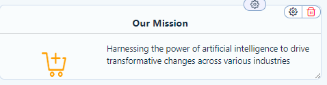Figure: Action Widget Template
3. Click **Settings** icon to view Properties pop-up.
You can view the following tabs on the **Settings** for this field.
### Properties
This section contains the list of properties using which the Application Designer can configure the respective widget feature. 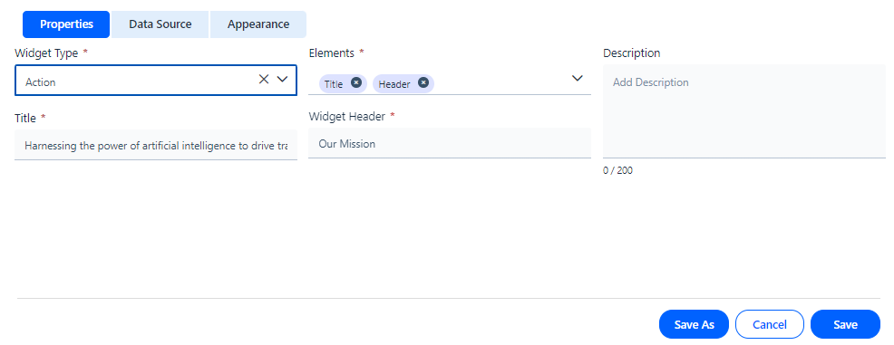Figure: Properties To know more about the fields available under the Properties section, see Field Description below.
Field Description
| Properties |
| --- |
| Widget Type | Select **Action Widget** from the drop-down list. |
| Description | Type the details of widget functionality. |
| Elements | Type the element **Title** and **Header** that should be displayed on the widget screen. |
| Title | Type the name of the widget. |
| Header | Specify the header for the widget. |
### Data Source
This section contains the list of features using which the Application Designercan select **Source**, **Application**, **Module**, **Table**, and **Form**.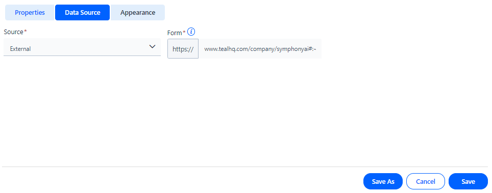Figure: Data Source The table below contains the list of fields and their descriptions that are available under the **Data Source** section: Field Description
| **Data Source** |
| --- |
| Internal | Select the **Date Source** as **Ex****ternal** from the drop-down list. |
| Form | Define the **Form** using which the widget should open when you click on it. |
### Appearance
This section contains the list of features using which the Application Designer can select **Icon**, **Title**, **Title,** **Header Text**, **Data Text**, and **Background** for the widget.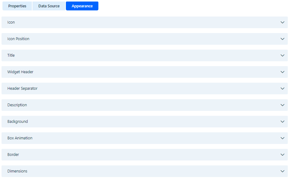
Figure: Appearance tab
The table below contains the list of fields and their descriptions that are available under the **Appearance** section:
Field Description
| Appearance |
| --- |
| **Icon** |
| Icon Upload | Select the Icon to be uploaded. Figure: Icon selection |
| Icon Position | Select the position for the icon by selecting the size and padding. 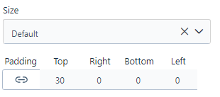Figure: Icon size and Padding |
| **Title** |
| Text Type | Define the text type. |
| Text Color | Select the text color for widget. |
| Text Size | Select the preferred text size. |
| Text Style | Choose the style for the font. |
| Text Alignment | Select the preferred alignment for the font. |
| Header Separator |
| Border | Select the type of border. 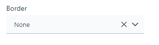Figure: Border Type |
| Description |
| Text Type | Select the text type for the number. |
| Text Size | Select the text size for the number. |
| Text Color Type | Select the text color for the number. |
| Text Style | Select the text style for the number. |
| Text Alignment | Select the text alignment for the number. |
| **Background** |
| Background Type | Select the preferred background type. Figure: Background |
| **Box Animation** | Select the Bottom Right and Top Left (H-Offset, V-Offset, Blur Radius, Spread Radius), Transform Scale (X-Axis, Y-Axis), Color, Transition Time, and Color 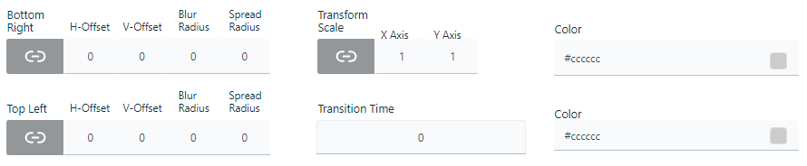Figure: Box Animation |
| **Border** | Select the Border fill for the widget. Specify the Border, Side, Width, Color and Radius for the fill.  Figure: Border |
| **Dimensions** | You can style the border by selecting the desired Dimension value.Figure: Dimension |
You can click **Save** to save the configuration. The configured widget appears as shown below.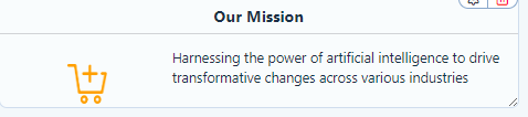 Figure: Vision Widget